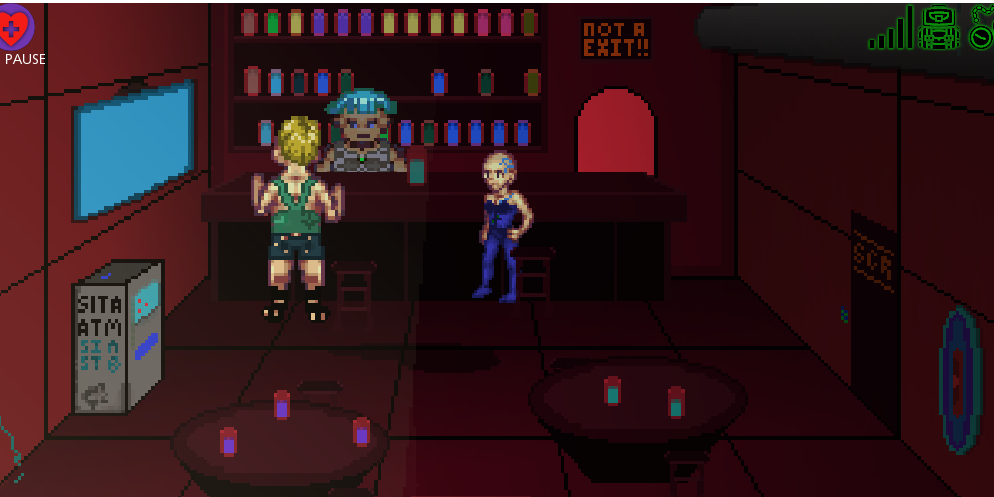
As September ended with me just finishing 1 stage of the 'zelda-like' half of Blue Noise, and my enthusiasm for the project still high, the decision to continue and do the '2d point and click overworld' concept was pretty easy to justify. It would still be a new genre and a new project in a month after all!
Conceptually a point and click adventure is pretty simple it turns out. In Godot at least if you have a solid grasp of areas, mouse picking and simple nav2d meshes, you can build up a basic engine pretty fast. In fact I surprised myself and got the basics down in under a week. The trick really was it needed artwork, and I really started to hit up pixel art tutorials (specifically Pixel Pete) to try to get the look and feel pinned down. I watched his rock tutorial. I spent 20 minutes making a rock.
The result was a lot more 'content building' then coding. I borrowed 1 image and made 2 different 'scenes' from scratch, edited sprites to make 5 characters, and built up a number of 'doodads' to populate my areas. It all lands pretty much under 'serviceable' but I feel better knowing the kind of things I ask artists for a bit more directly.
In addition to the 'Streets' I built up a few more dungeons, mainly tutorials as that was the biggest issue with the September demo. An intro was made and the story fleshed out more. Notable I was seeking a better dialog solution than the at this point very hacked up Syndibox and Messagebox add ons, and stumbled on Dialogic, then at version 0.8. I tried it, but it didn't work quickly so I dropped it and figured I'd maybe take a look at it later... today I'm a happy and regular contributor!
Most of the new code this month went in combining the base project with the 'streets' mode. It was very hacky, and when I revisited the project later on would have to be ENTIRELY rewritten.
Blue Noise: Streets Pros (1 year later)
- I'm proud of the art work I did, even if its a bit crude. It gets what I need to across pretty well
- The point and click engine is actually pretty solid, and I like most all I did to get it working
- The music choices I found get stuck in my head to this day
Blue Noise: Streets Cons (1 year later)
- The shader work is copy-pasta and kinda bad despite that. Given how the highlight shader works I don't' know why I didn't make doors separate sprites
- Getting the glue to hold the two things together was ugly and only mostly functional
- The controls are actually are actually WORSE with the addition of streets. I chose the worst way to transition from point and click to zelda-like imaginable
On a revisit, I'd change...
- Same as September... The controls, full stop. The 2021 revisions are WAY better
- Again, little else. I AM revisiting things, and its mostly expansion that's happening, not re-creating.
